Guest Spot: Kristen Terrana

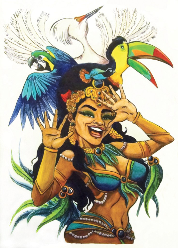
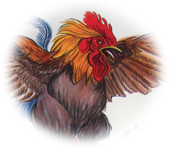
My Precious Detail © Kristen TerranaOK, let’s crank up the heat and kick out the jams. Kristen Terrana’s Mad Hatter Girls should do the trick perfectly.

I first fell in love with My Precious after watching the artist at work on YouTube and was thrilled to meet her cohorts in person at Jadite Gallery, this spring.

Born and raised in New York City,
Ms. Terrana is accustomed to the frenetic sights and sounds that bombard our minds daily. The vibrancy that is part of this city is reflected in her use of bright color and movement, and she finds the fluidity of watercolors and ink to be ideal for expressing this excitement.

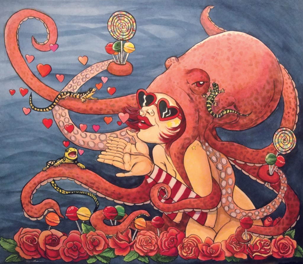
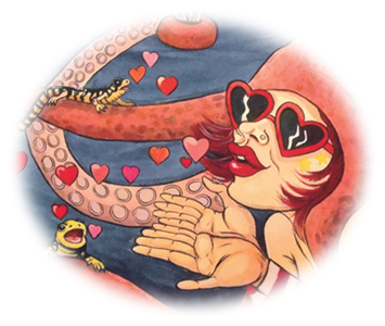
Here’s the good word from the artist: “My subject matter can often be grotesque, and I exaggerate the emotions of each piece. There is a dark humor and irony hidden for the viewer to find. Things may appear light-hearted from afar, but upon closer inspection, there is a darker truth. I take inspiration Suck My Kiss Detail © Kristen Terranafrom the German Expressionists, who used their art to comment on the ugliness that they saw within society. I enjoy using art in a similar way, to make a statement about vanity and the pressures on women today.
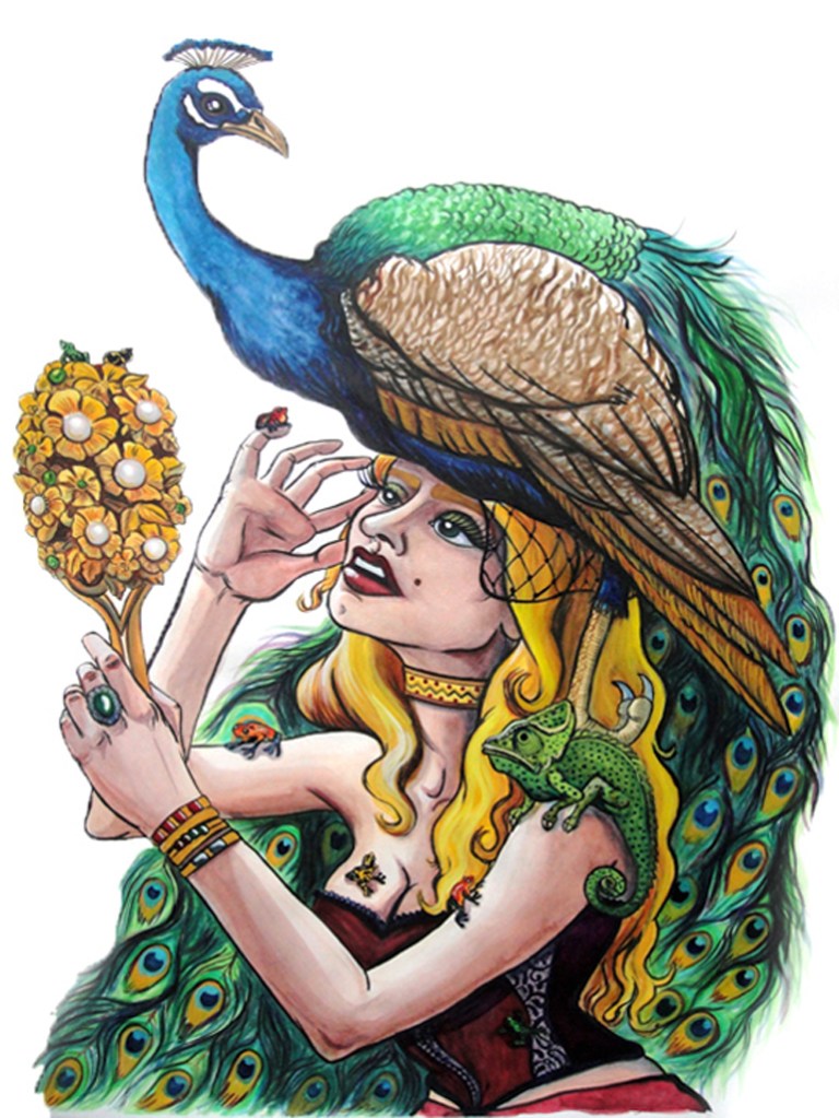
“My latest series depicts a group of extraordinary characters called the ‘Mad Hatter Girls.’ Facing the demands of society to stay young and beautiful ‘naturally,’ the women in these paintings heavily adorn themselves with animals. The women believe they are enhancing their beauty and hiding their flaws, under feathers, fur, and scales. But the beauty of nature is taken to the extreme. The Mad Hatters become overpowered by their animal counterparts, and their vulnerabilities become revealed in the chaos.”

And their strength. Bold, giddy, and (sometimes sweetly) demented – Guest Spot is delighted to present My Precious, One Headlight, Bird of Paradise, Suck My Kiss,
and All that Glitters, by Kristen Terrana.
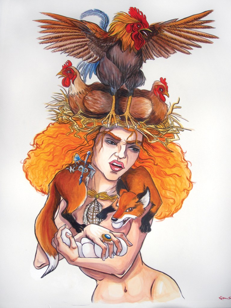
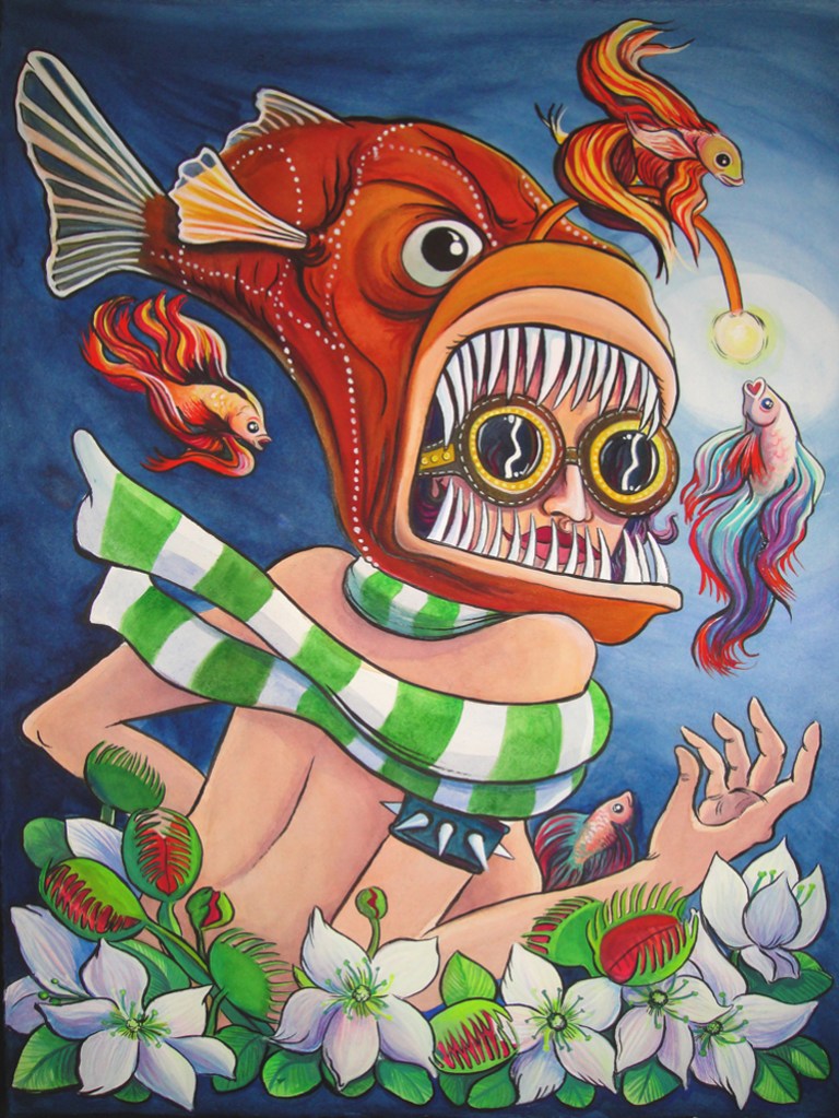
My Precious © Kristen TerranaOne Headlight © Kristen TerranaBird of Paradise © Kristen TerranaSuck My Kiss © Kristen TerranaAll that Glitters © Kristen Terrana

Original artwork by Kristen Terrana © 2011.
Portfolio: www.kristenterrana.com; @kristenkahlo on Instagram

Posted in Guest Spot! | Tagged , , , , , | 1 Comment

Good Friend Down

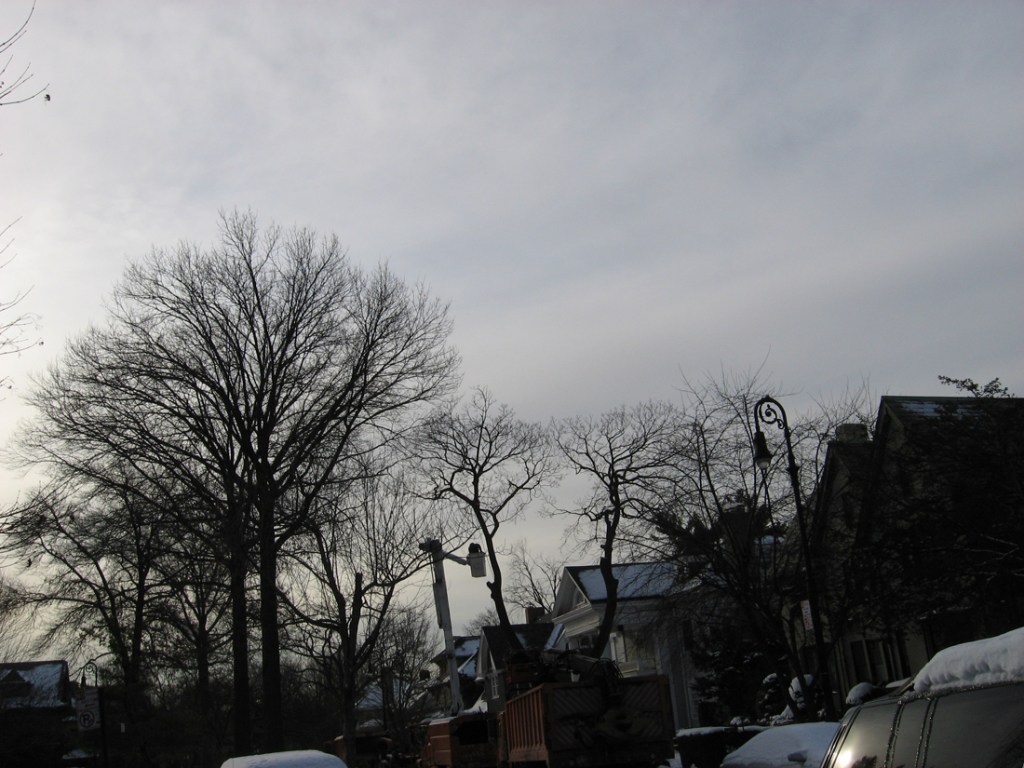
Between the Oaks © Catherine RutgersThey are giants. Two oaks towering more than six stories high. And in between was once a sinuous and not so small maple tree. Look through the teen-aged pine and you’ll see her on a snowy day.

Weed whackers and leaf blowers drive me crazy. But the sounds of a chainsaw and attendant wood chipper wrack my deepest nerve. I rarely document the final demise of the various peak-growth beauties in my neighborhood, perhaps feeling it too deeply, even though I’ve watched it more than once.

This time, I took out the camera and captured the chop-down on January 14, 2011, the messy aftermath three days later.

Tough and Dangerous Job © Catherine RutgersMostly, we’re losing maples to disease and age. One magnificent tree spread high above rooftops, across two-homes-worth of backyard lawn, perfect against the sunset for years and years, then lost all its leaves in a few midsummer weeks. Irretrievable. And though the decaying branches would have made lovely homes for birds and insects, they must have been thought of as likely for falling in the stormy winds that have become increasingly common.

It’s a tough and hazardous job, taking down a behemoth. The crew worked hard through most of the day. But I think they cut this one down too soon. It has taken me six months to complete this winter story, move through the cutting and on to remembering our splendid friendship, to cheers for the beauty of branches, leaves, and sky.

The Peak © Catherine RutgersOrange, Green, and White © Catherine RutgersPerspective Image 2283 © Catherine RutgersTied and Inverted © Catherine RutgersWithout © Catherine RutgersShades of Night Are Falling © Catherine RutgersIn Snow © Catherine RutgersRed Sky at Night Image 1272 © Catherine RutgersBuds of Spring © Catherine Rutgers

All images and text in this post are by Catherine Rutgers © 2011.

Posted in Snapped | Tagged , , , , | 1 Comment

Guest Spot: Brian Olewnick

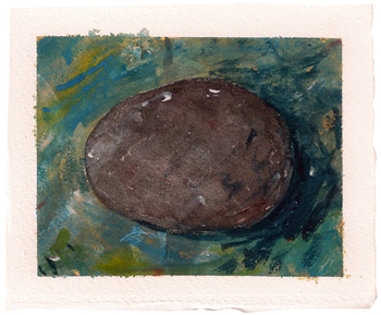
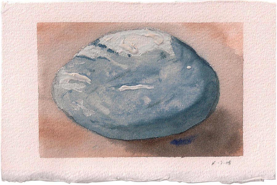
Stone 09C © Brian OlewnickBrian Olewnick is a painter, a writer, and curator of an outstanding social-network page for those who seek visual inspiration and lively conversation on art and music. He’s also creator of the blog “Just Outside,” which features write-ups on new recorded music, concerts, the occasional movie, and “dips into” his vinyl collection.

I’ve known Mr. Olewnick since 1968, and he was always known for his artwork. So it was a remarkable surprise, during the early years of the 21st century, to hear him say he’d rather look at paintings than make them. The hiatus, however, was not interminable. Here’s the good word from the artist:

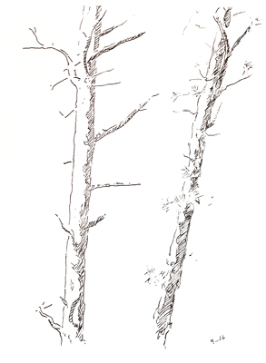
Two Pines Sketch 25 © Brian Olewnick

Discrete objects in separate but shared space: two pines, drawing by Brian Olewnick.

“I’d drawn and painted most of my life but, around 2003, I took a break, writing having begun to take up most of my spare time, plus having the sense that I’d done more or less what I could do in the visual field. Strenuous urging from several friends spurred my return in the spring of 2009, and I’ve been doing what I can as time permits since then.

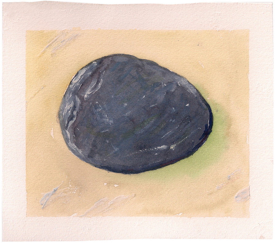
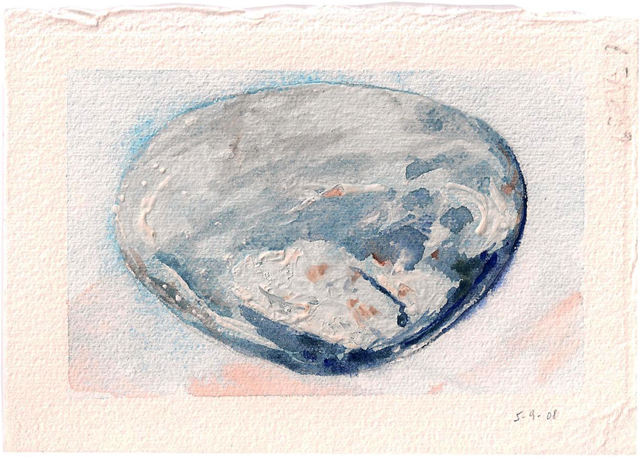
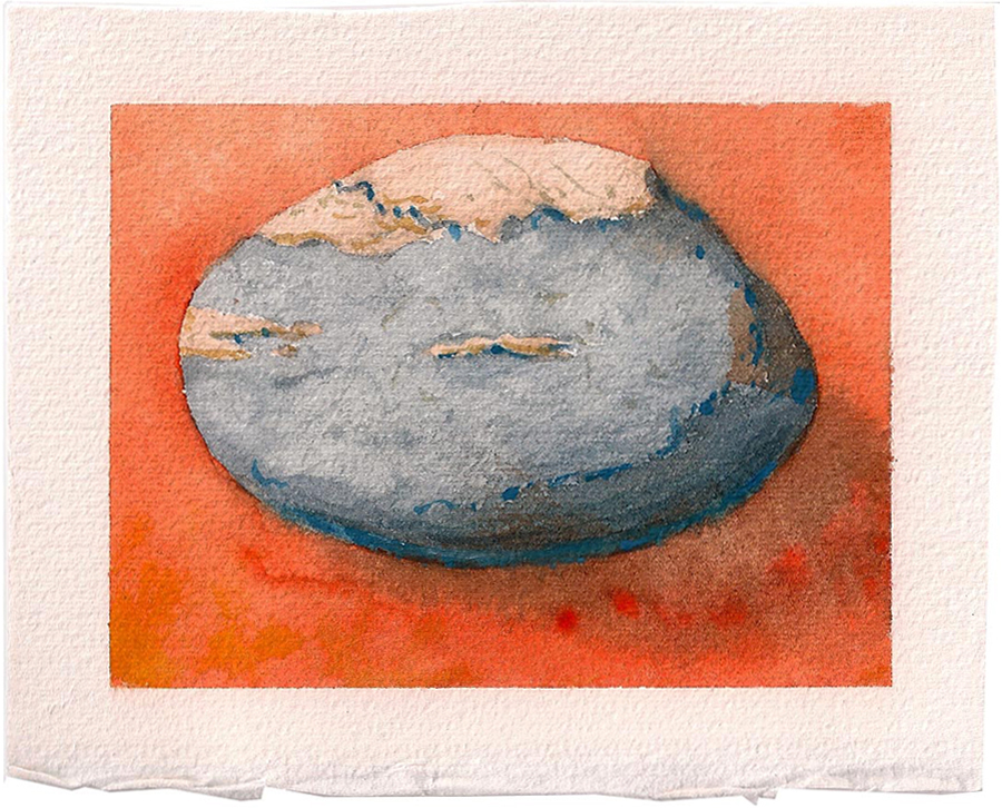
“I’ve always tended to work small, often using the same objects I’ve kept around and grown attached to for decades, showing a marked preference for stones, sticks, and other odds and ends. I’ll frequently do a number of versions of the same object, often in the same position, while varying other properties.

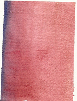
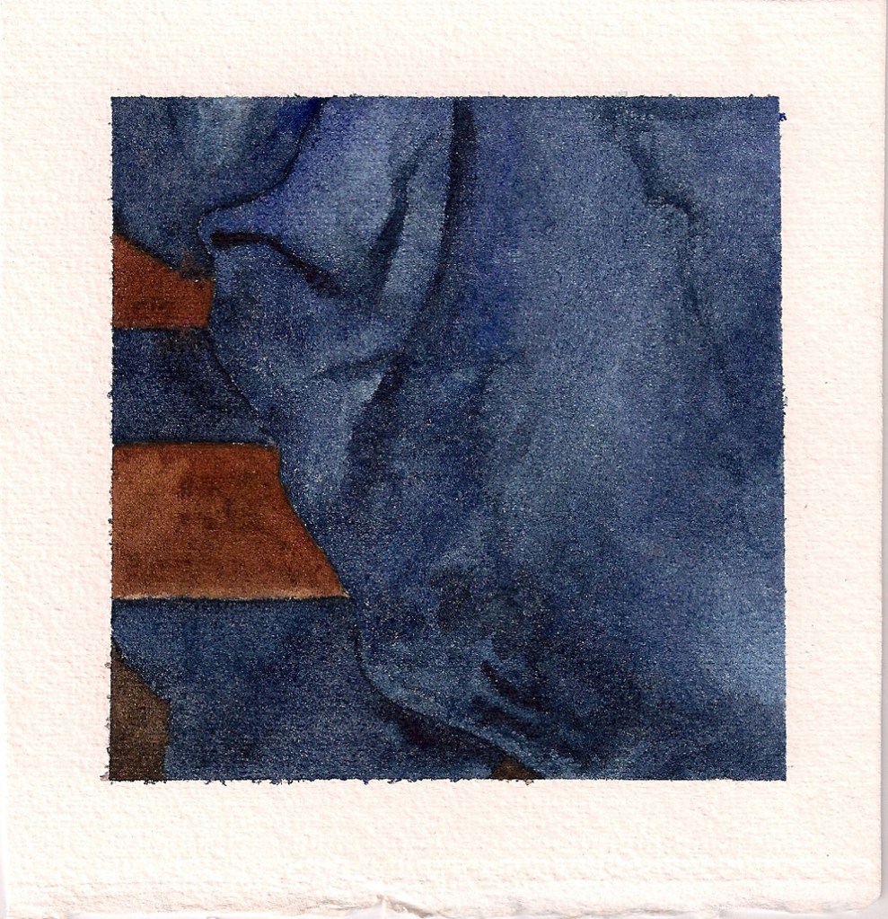
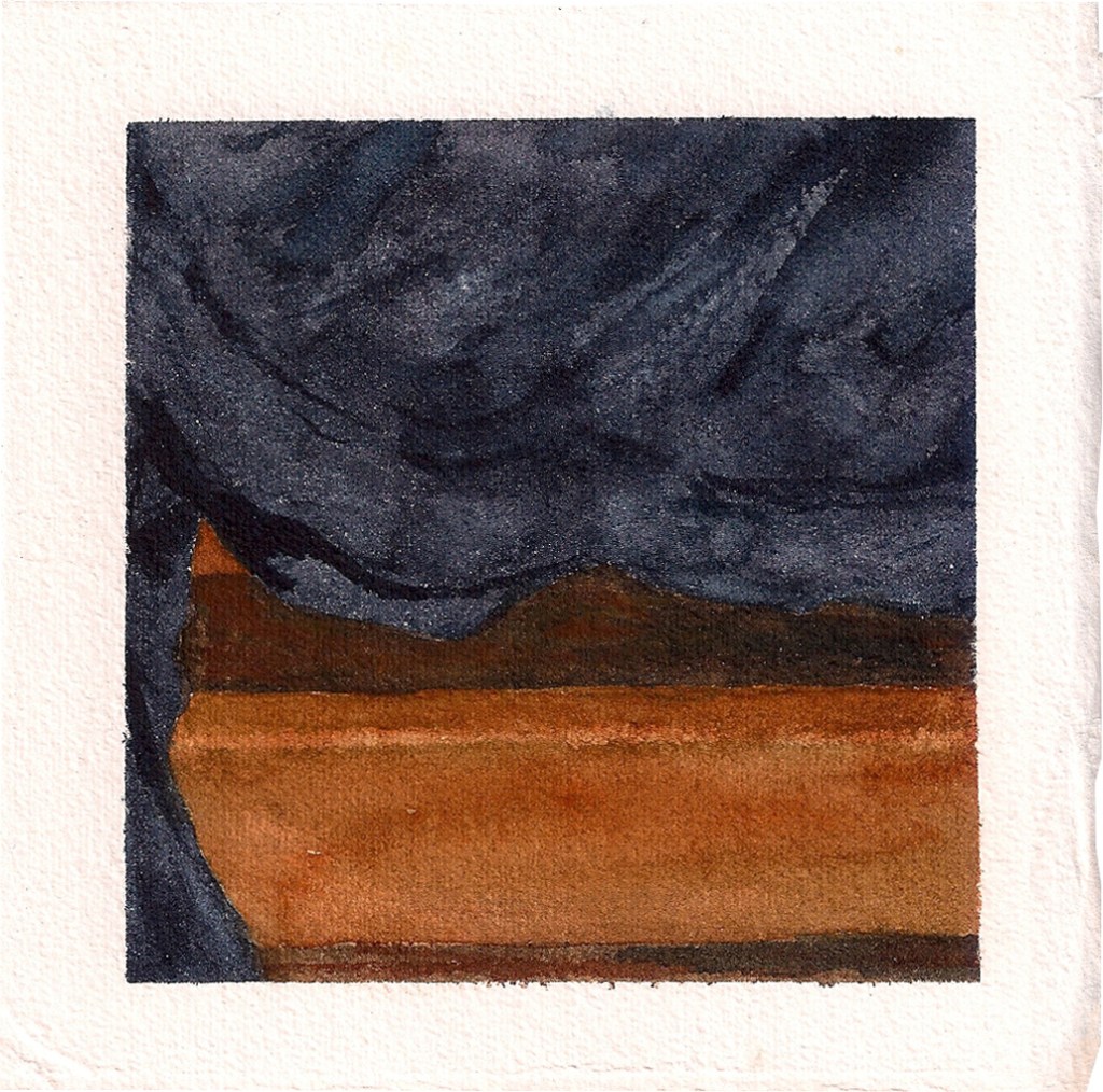
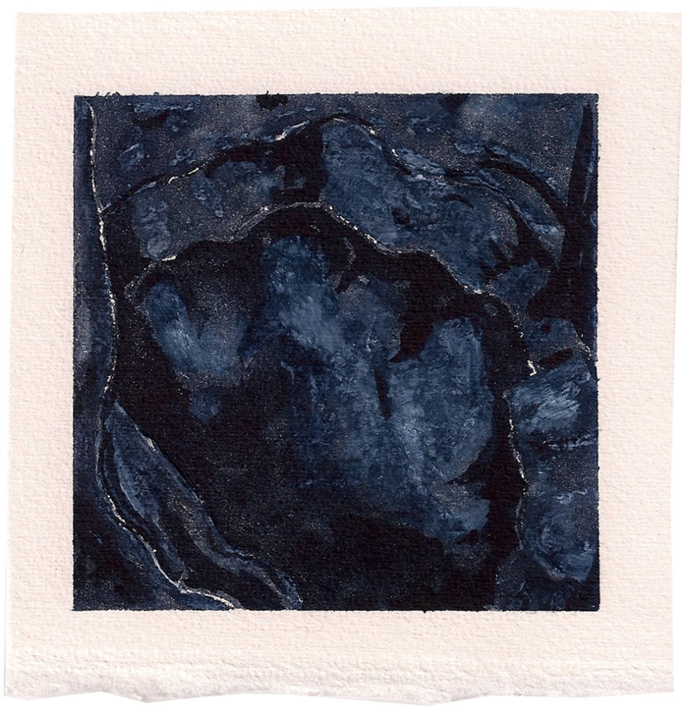
“Though I tend to work in a realist manner, I’ve always loved abstract painting, simply feeling it wasn’t my territory. A happy halfway point has been painting fabric. I had the idea of doing sets of four watercolors of t-shirts of mine (another kind of object I’m very attached to). First, a red one, then an indigo one (which appears after the text) and finally a light gray one.

Scan 0003-2 © Brian Olewnick

Fully abstract: kind of a bastard child of Rothko and Newman, several times removed.

“I was able to straddle a line between color field and realism that I enjoyed very much, likening it (in approach, certainly not in quality ) to Morton Feldman’s late piano music. In the gray set, I began working in extremely light washes, almost not there (a personal homage to Agnes Martin) and think they’re among the most successful things I’ve done – but they don’t scan well at all! I’ll also do the occasional fully abstract piece, kind of bastard children of Rothko and Newman, several times removed, though I don’t feel entirely comfortable there.

“My drawing seems to vacillate between similar poles – I’ve always liked the idea of two discrete objects in a work, in separate but shared space, and did a series of pines in the fall of 2009, one of which is shown above. At the same time, I began to greatly enjoy the plain markings of the pen on paper (after coming to more greatly appreciate Twombly, I think) and have done a number of sparser things, still reality based.”

Guest Spot is very pleased to present a selection of recent work by Brian Olewnick. Back in the three-dimensional world, the originals are in the vicinity of five by five inches. Here, you can right-click to view a larger, digital image.

Indigo Shirt Number One © Brian Olewnick

Indigo Shirt Number Four © Brian OlewnickIndigo Shirt Number Three © Brian OlewnickStone 09 © Brian OlewnickStone 01 © Brian OlewnickStone 02 © Brian OlewnickStone 04 © Brian OlewnickAll images in this Guest Spot represent original artwork by Brian Olewnick © 2011.

Posted in Guest Spot! | Tagged , , , | 1 Comment

Sift, Freak, Reap: Morning After

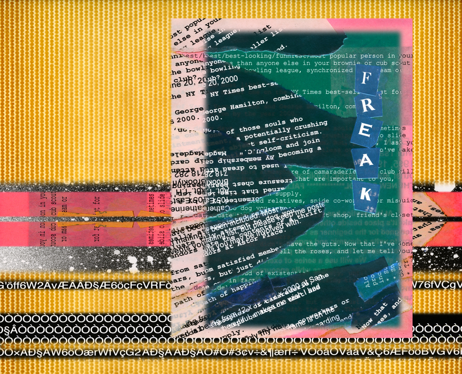
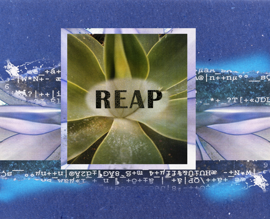
Morning After © Catherine Rutgers 2011Back in the year 2000 – remember when nearly everyone wrote ‘year 2000’? was it just too flabbergasting to accept 2000 standing alone? – I made three small collages that illustrate my creative process.

It’s nearly the same every time. I begin by sifting through the raw materials. Inevitably reach a point where either abundance or a frustrating lack freaks me out. Then slowly but surely move into certainty and the wonderful point of completing a new piece.

Yesterday, I had a tight deadline for applying to a show at 440 Gallery in Brooklyn. It’s a lovely artist-run collective, and the theme of their upcoming exhibit is “Text.” There wasn’t any question about starting with new scans of the creative-process collages, which meant taking the frames apart, but that’s OK.

Then the search for new resources began, and the hard part about that was limiting the choices. This session features some exciting elements: cardboard from 1937; a page from an old (circa late 1980s) photo album that fell apart; spray paint on dot-matrix printer paper; and, of course, the original Sift, Freak and Reap.

The morning after was cool and gray, with a delightful soft-spring misty rain. Setting the green of May into luscious relief. In June, I’ll find out whether the new artwork is accepted for the show. Meanwhile, I think it’s ideal for the newest Revelations* and hope you’ll enjoy the fruits of the calm that comes after the freakout.

Sprayed Paint © Catherine Rutgers 2011Cardboard 1937 © Catherine Rutgers 2011Copper and Sift © Catherine Rutgers 2011Freaked Sands © Catherine Rutgers 2011Impact and Results © Catherine Rutgers 2011* Revelations is the CatRutgers4Art category for “ongoing experiments in digital art, based on original painting, drawing, photos, mixed media and image capture.” Seventy-three out of 152 posts are revelations. At some point I might try out new categories!
Original artwork and text by Catherine Rutgers © 2011-2023

Posted in Revelations | Tagged , , , | 2 Comments

Guest Spot: Jamie Kelty

Franklin Street Detail © Jamie KeltyWhile growing up on a farm in Kansas, Jamie Kelty developed a strong connection to the earth and to the hand-made. Now that the artist is living in New York, this connection remains visible in her work.

In Kelty’s oil paintings, colors appear as though dragged through the soil, giving them a visceral quality and textural depth, at once urban and elemental. Tearing, scraping, and sewing the canvas imbue the paintings with a palimpsest- like effect, often leaving traces of a previous incarnation. Recycled and assembled objects embedded in the fabric act as props in a visual drama.

Guest Spot is delighted to present six watercolor-collages by Jamie Kelty, from the winter of 2010-2011. Here’s the good word from Ms. Kelty: “Looking at them now, I realize that I must have been searching for the sun. These characters seem to be in warmer climates. The bits of paraphernalia are collected from gift wrap, old dictionaries, ticket stubs, and magazine ads. I like to use these bits to imbue a sort of personality for the painted figures, and to add color and texture to the surface of the paper.”

Kelty’s distinctive portraits bring a splash of color and vivid personality to 6 x 4-inch sketches inspired by people in her neighborhood. In a dexterous combination of painting and assemblage, she teases out each character’s attitude and emotions, inviting us to imagine their stories. And to share in the warmth of her vision.

You can see her portfolio here, plus view the wonderful @jamiekelty on Instagram.

Cool Chic © Jamie KeltyTogether © Jamie KeltyThe Romantics © Jamie KeltyThe Holiday © Jamie KeltyThe Writer © Jamie KeltyFranklin Street © Jamie KeltyAll artwork in this post is by Jamie Kelty © 2011.

Posted in Guest Spot! | Tagged , , , | 1 Comment