Meet Zen and Stormy

Moon Over Mud © Catherine Rutgers 2015What’s your sign? There was a time when this was an inevitable question, somewhere in my life between “Who’s your favorite band?” and “What kind of work do you do?”

Hello, artists! This is me being wildly sympathetic because I know what it’s like to struggle with the work question. Or in the good moments, have a response that feels spot on.
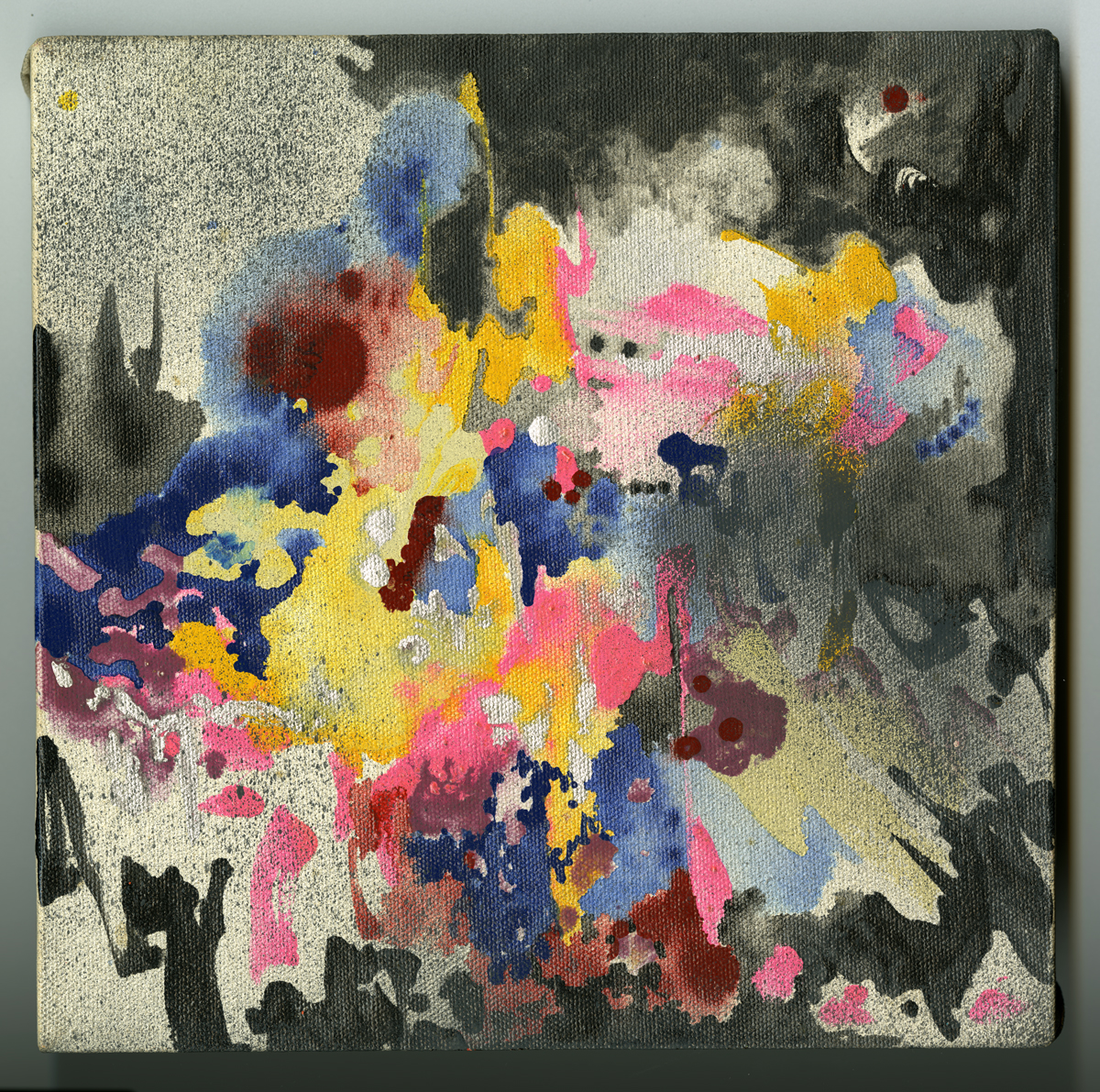
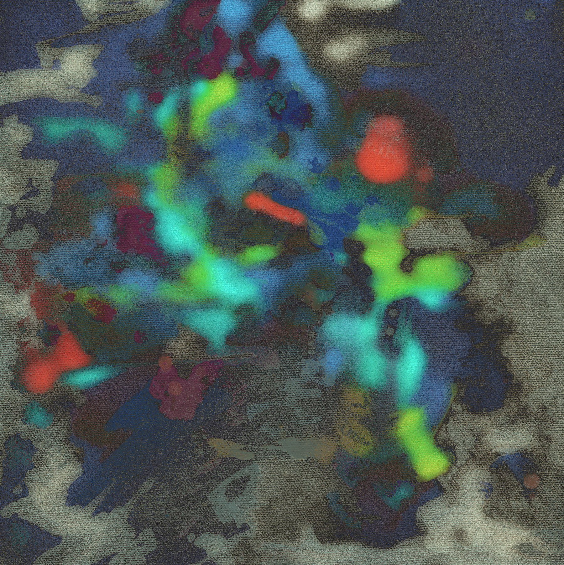
Anyway, I’m a Gemini. Hence, the contrasts, like “Zen” and “Stormy” – two of ten canvases that were all 10 x 10 inches. Yes, I love that kind of symmetry, and often think about numbers when making things. Like astrological signs, this too is a scaffold, a launch pad for creative flight.

In 1987, I was one year into a fourteen-year stretch working with spray paint and oil-based enamels in ways that were inspired by graffiti, the impressionists, space travel, and the flashes of light seen only when my eyes are closed. For “Whispering Spheres,” my solo show at the Cary Arboretum, there were eighteen paintings altogether, the largest was 48 x 84 inches. What a beautiful space that was. High ceilings, skylights, growing plants around the room. Perfect, perfect setting.

And a review by Wayne Lempka in the Poughkeepsie Journal, in which Zen had a cameo: “In ‘Illustration’ one is drawn into a subtle yet powerful organic image which rises out of a center palette of blues and purples. By drawing with the brush, the artist is able to create sheets of color that glow or brood from above or below. The two most successful small canvases, ‘Zen’ and ‘Pink Orbit,’ are so tightly put together that the shifting of any one element could cause the others to fall apart. The seductive use of colors and forms in both works seems to hint at secrets hidden from the viewer.”

Or uncover new secrets as I translate their character from canvas to screen.

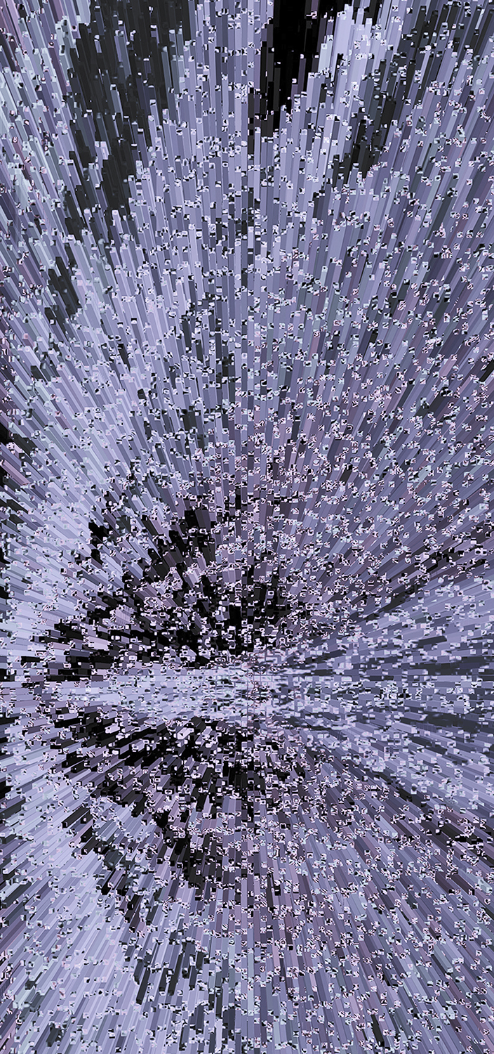
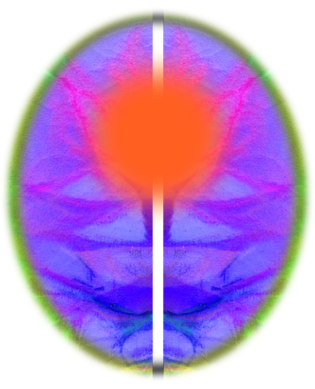
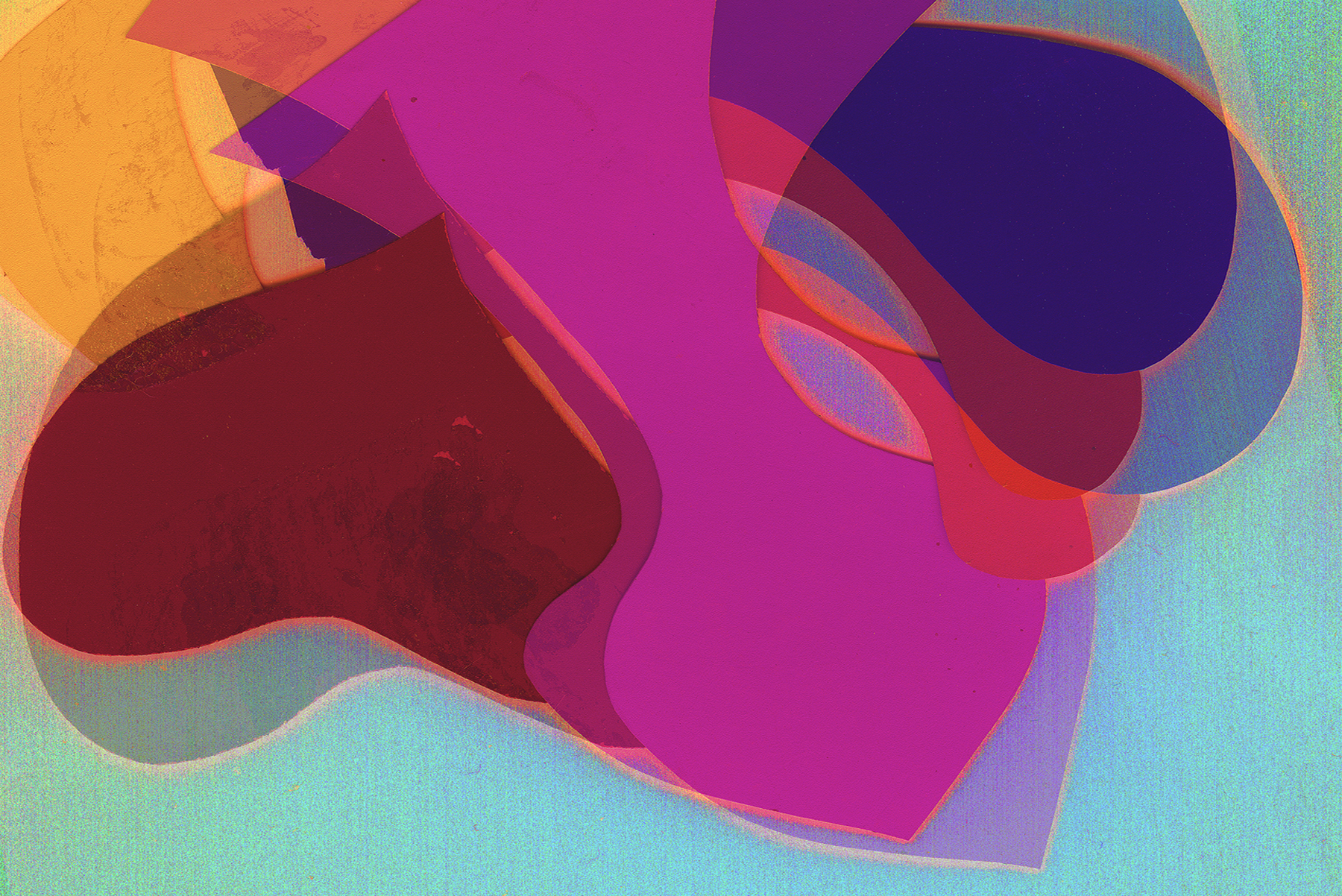
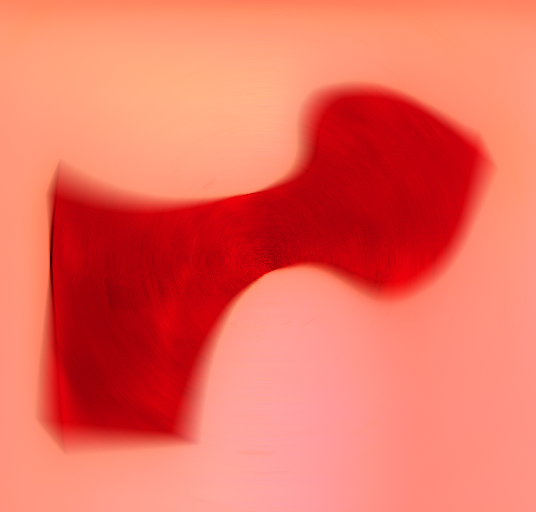
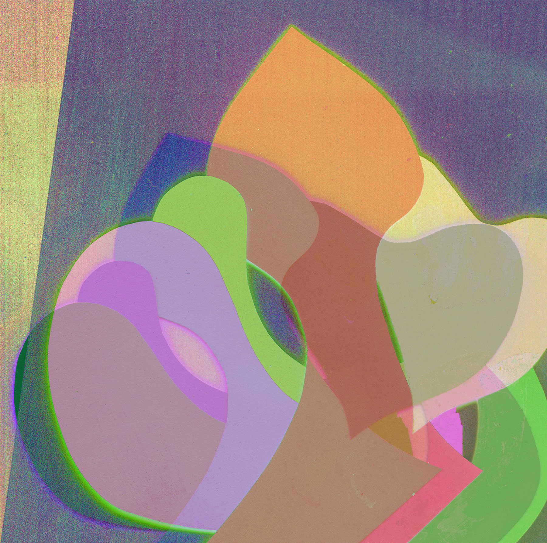
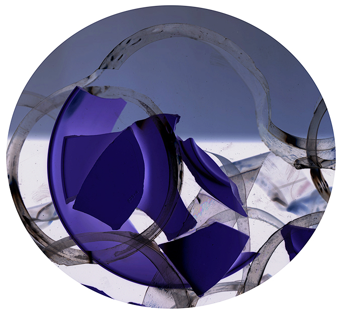
00 Moon Over Mud (smaller image above) • 01 Zen 1987 • 02 Stormy 1987 • 03 One Nine Eight Seven • 04 I Am the Evidence • 05 Starship Serene • 06 Ever Deep • 07 Comeuppance Conundrum • 08 Love Me Two Times • 09 Still Waters • 10 Reach Up and Stretch • 11 Polar Coordinate • 12 Ruby Red Crossover • 13 Built to Last • 14 Zen Difference Cloud Detail © Catherine Rutgers 2015Zen 1987 © Catherine Rutgers 2015 Stormy 1987 © Catherine Rutgers 2015 One Nine Eight Seven © Catherine Rutgers 2015 I Am the Evidence © Catherine Rutgers 2015 Starship Serene © Catherine Rutgers 2015 Ever Deep © Catherine Rutgers 2015 Comeuppance Conundrum © Catherine Rutgers 2015 Love Me Two Times © Catherine Rutgers 2015 Still Waters © Catherine Rutgers 2015 Reach Up and Stretch Out © Catherine Rutgers 2015 Polar Coordinate © Catherine Rutgers 2015 Ruby Red Crossover © Catherine Rutgers 2015 Built to Last © Catherine Rutgers 2015 Zen Difference Cloud Detail © Catherine Rutgers 2015

 Images and text by Catherine Rutgers © 2015

Posted in Revelations | Tagged , , | 3 Comments

Sweet Fun in the Summertime!

Cameo for Saturated Bliss © Catherine Rutgers 2015Shall we frolic? Yes, we shall. Recently inspired by a rumor that the Hot & Sticky show, opening June 16th at Smith & Jones, would include some hot-and-steamy artwork, I decided to try my hand, so to speak, at just that type of image.

Stepping up to the challenge, I created fantasy companions for “Saturated Bliss,” which will appear in the aforementioned show as an archival pigment print and appears in cameo to your left.

The virtual pals turned out to be more sweet and juicy than hot and sticky, and some took off entirely in their own direction. But I love them all anyway. With relish!

Pearl in the Sea of Joy © Catherine Rutgers 2015

Variation on the Blessed Glue © Catherine Rutgers 2015

Little New Love Shack © Catherine Rutgers 2015

Sticky One © Catherine Rutgers 2015

Ragged But Happy © Catherine Rutgers 2015

My Heart Was © Catherine Rutgers 2015

The Treasure You Are © Catherine Rutgers 2015

Swimming in This © Catherine Rutgers 2015

Light One © Catherine Rutgers 2015

Wind and Wave © Catherine Rutgers 2015

Filtered Moon © Catherine Rutgers 2015

Replete © Catherine Rutgers 2015

Catherine Rutgers © 2015

Posted in Revelations | Tagged , | 1 Comment

Behind the Scene (Preparations for an Exhibit)

Deep in the Glimmering Dream © Catherine Rutgers 2015

The pigment print of Deep in the Glimmering Dream (8 x 7.72 inches, on 11 x 14 paper, edition of 11) is available directly from Cat Rutgers, contact https://catrutgers4art.com/about/

This time of year, when the hours of daylight here in the northern hemisphere grow longer and longer as they come near to their peak, brings out the best in me. Among the wonderful developments this season, not only will I be part of the Hot & Sticky show in June, at the intriguing Brooklyn-based gallery Smith&Jones, curated by Joseph A. W. Quintela, one of my prints – “Deep in the Glimmering Dream” – is now a Weekly Feature. [Apparently everything changes, without notification. As of October 2017, I find that Smith & Jones no longer offers this print.]

While “Glimmering” headlines this post, it is one of six pieces created for the gallery to choose from. And so, we now peer even more deeply into the mysterious potential of obscure urban corners and everyday objects transformed.

Babylonian Gardens © Catherine Rutgers 2015

Molecular Origins © Catherine Rutgers 2015


Slices and Bursts © Catherine Rutgers 2015

Cushioned Jewels © Catherine Rutgers 2015

Look Again © Catherine Rutgers 2015

 Catherine Rutgers © 2015

Posted in Introductions & News | Tagged , , , | 3 Comments

SOTVC: The Violet and Green Edition

Serpentine Fire © Catherine Rutgers 2015Over the years, I’ve had various tag lines for my artwork. They were kind of like corporate names, if you can envision a company that is involved with absolutely nothing but making art or writing poetry or just generally sending out a riotous yet winsome identity that serves no purpose except my own.

Early on, circa mid-to-late seventies, it was Other World Artwork, a bit of a twist on the “Third World-First World” dichotomy that was much on our minds at the time. Then came Space Monkey/French Kiss Productions, in honor of the Patti Smith song, Ms. Smith in her awesome entirety, and a general celebration of the wholesomely erotic, followed by a brief appearance from the Fabulous Underachievers Club, of which I am the founder and president, although we haven’t had a meeting in ages.

Sometime during the 1990s, I switched to SOTVCSign of the Vibrating Colors—which pretty much sums up an everlasting thrill of mine: placing (or finding) colors next to each other that set off visual harmonics in a very radical way. Since the aughts, sad to say, there have been no such tags. But I do still seek out the vibrations.

Favored duets include blue alongside orange, turquoise next to pink, and purple, or perhaps more accurately, violet, against green. In any case, I always thought the purple-green scenario reflected complementary colors. Not really so, though I did find a “red-purple” directly across from a “yellow-green” in a color wheel that featured tertiary colors. Or are they hues?

Setting the lexicon aside, here’s a meditation on violet and green, in fairly subtle permutations and ranging as far as they want to from the scheme—which is exactly right as far as I’m concerned. Love, Cat

Impossible Landscape © Catherine Rutgers 2015Yellow-Green Shards © Catherine Rutgers 2015

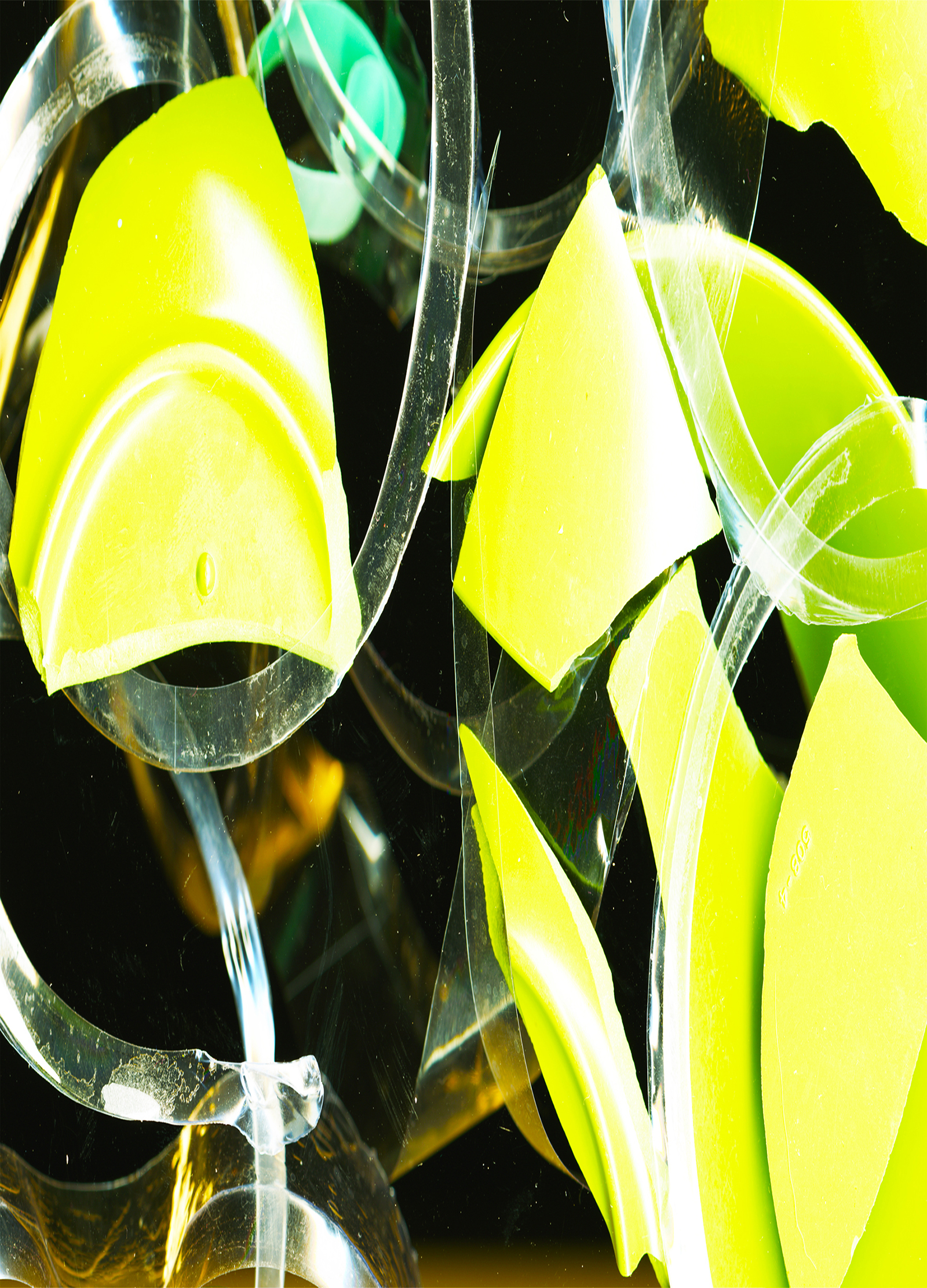
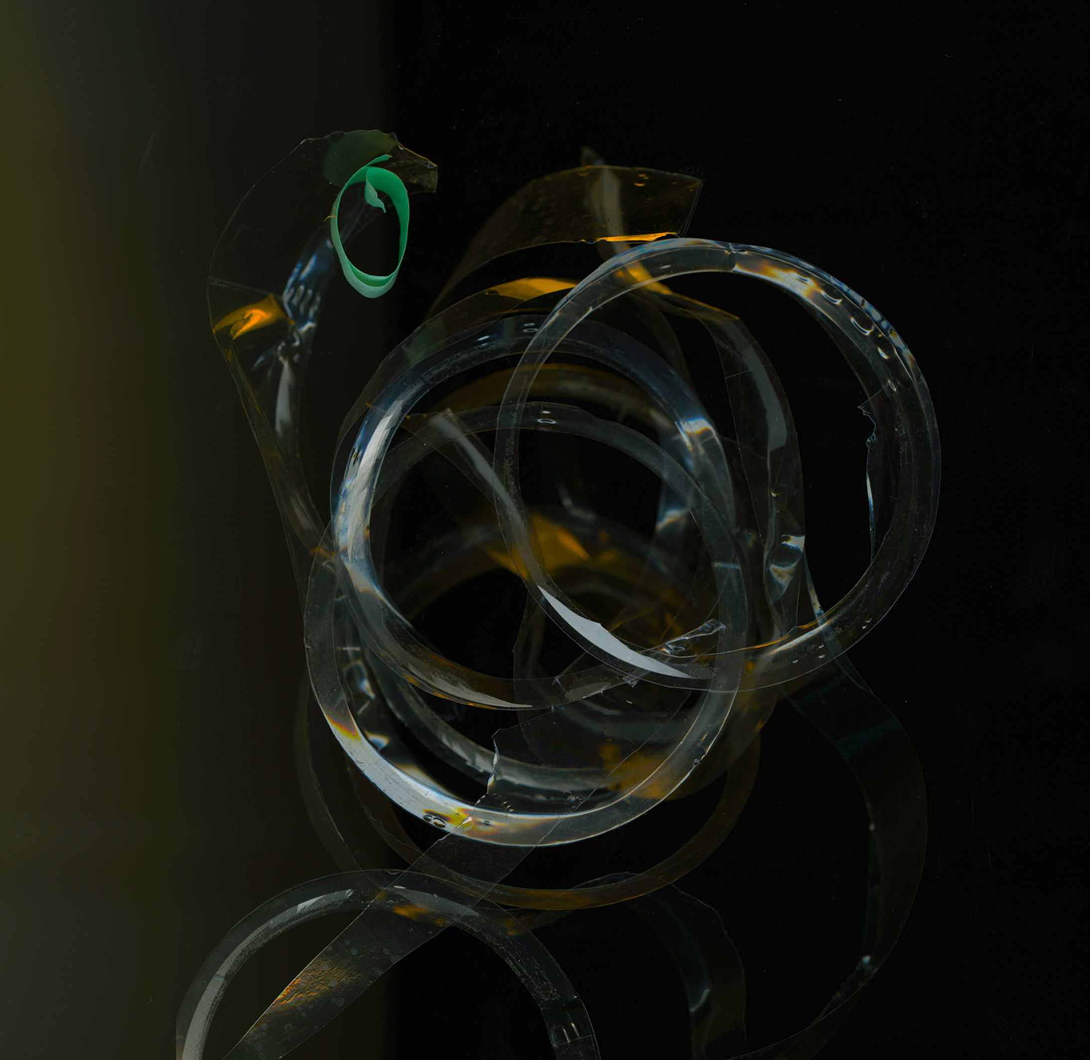
Violets Are Me © Catherine Rutgers 2015Remnant Crop © Catherine Rutgers 2015The Fist of Resistance © Catherine Rutgers 2015Sonar Fantasia © Catherine Rutgers 2015Just the Shadow © Catherine Rutgers 2015Who Could Say © Catherine Rutgers 2015December in February © Catherine Rutgers 2015Yellow-Green Crosses Violet © Catherine Rutgers 2015Cellophane © Catherine Rutgers 2015

Primordial Lick © Catherine Rutgers 2015

Exquisite Reassemblage © Catherine Rutgers 2015

 01 Serpentine Fire, 02 Impossible Landscape, 03 Yellow-Green Shards,
04 Violets Are Me, 05 Remnant Crop, 06 The Fist of Resistance,
07 Sonar Fantasia, 08 Just the Shadow, 09 Who Could Say,
10 December in February, 11 Yellow-Green Crosses Violet,
12 Cellophane, 13 Primordial Lick, 14 Exquisite Reassemblage
Images and words by Catherine Rutgers © 2015

Posted in Revelations | Tagged , , , , , | 1 Comment

Fun with Filters!

The Original February © Catherine Rutgers 2015

Not the kind you use in a fish tank, which are horribly smelly but keep your scaly pets afloat, or the ones you pop into the pitcher to help purify your tap water, but the kind that Adobe’s Photoshop supplies for those of us who love to play with images. Historically, I’ve been filter-averse, fearful of creating something that’s “too photoshoppy.” More recently, I’ve enjoyed discovering what they can do and taking the options as far as I can.

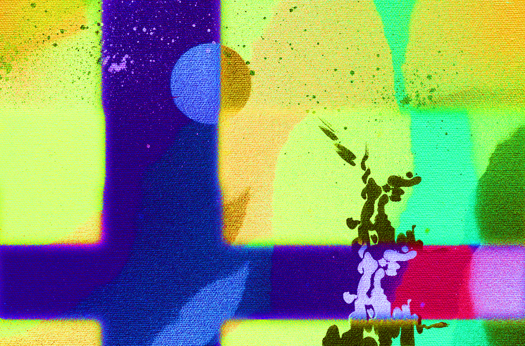
The source material is my not-so-high-quality snapshot of a collage (above). The in-between step adds a flip side, with effects from changing brightness, contrast, and saturation. Then we have the recent development: solarized oil paint. While the central figure reminds me more than a little of the Donnie Darko rabbit, that’s actually one of my favorite movies.
In Transit © Catherine Rutgers 2015
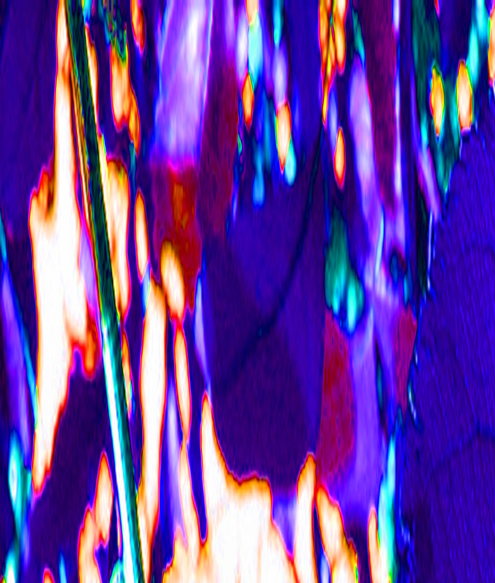
Solarized Oil Paint © Catherine Rutgers 2015

If you’re connected to a big screen, open this up to enjoy the full-size view!
Visions by Catherine Rutgers © 2015

Posted in Snapped | Tagged , | Leave a comment