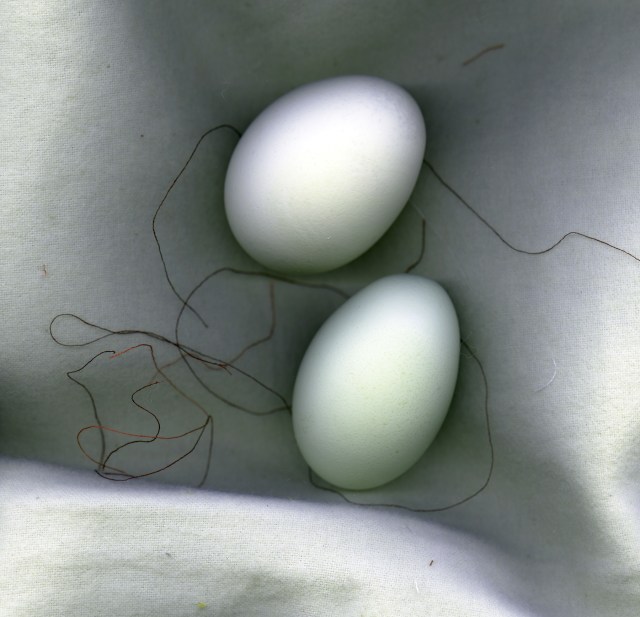
The pigment print of Deep in the Glimmering Dream (8 x 7.72 inches, on 11 x 14 paper, edition of 11) is available directly from Cat Rutgers, contact https://catrutgers4art.com/about/
This time of year, when the hours of daylight here in the northern hemisphere grow longer and longer as they come near to their peak, brings out the best in me. Among the wonderful developments this season, not only will I be part of the Hot & Sticky show in June, at the intriguing Brooklyn-based gallery Smith&Jones, curated by Joseph A. W. Quintela, one of my prints – “Deep in the Glimmering Dream” – is now a Weekly Feature. [Apparently everything changes, without notification. As of October 2017, I find that Smith & Jones no longer offers this print.]
While “Glimmering” headlines this post, it is one of six pieces created for the gallery to choose from. And so, we now peer even more deeply into the mysterious potential of obscure urban corners and everyday objects transformed.
Catherine Rutgers © 2015


With all these vivid colors, I get the feeling you are in your Van Gogh period. I like Cushioned Jewels best.
Chris
LikeLike
Hello, Chris, and many thanks for your comment. I am delighted and flattered by the reference to Van Gogh. By the way, I tried out “Cushioned Jewels” in a deep-purple-blue scheme and an inverted green mode, but wound up liking the more delicate yet tasty orange and greens you see here.
LikeLike
Thanks for the like, orangeleisure!!
LikeLike