 They were labors of love, deeply personal yet public, mostly designed by hand, and dependent on access to a very cool copy shop.
They were more love note than publicity as practiced in the current century. No email address, no website. They don’t tout an event, they’re valentines or happy new year or spring equinox or may day. I liked not using capital letters when you’re supposed to. I always spelled always as allways. Ragged edges, odd sizes, suggest some editions were cut by hand, on a kind-of-scary cutting board.
I wanted to connect. And I did. A few readers might even remember them.
The first year, 1988, reflected my long-term love of drawing freehand squiggles (there’s a sample above). Photocopied onto cardstock, they’re cryptic maps to a destination no longer recalled or perhaps never known. Adorned with spray paint, through a stencil and also not. Then a final touch of gold ink, from a pen with a ball bearing inside that makes a satisfying sound as it stirs up the liquid gilt.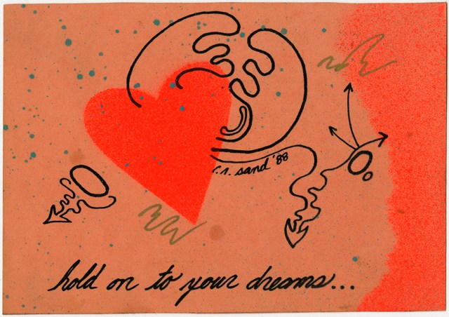
1989 was an odd choice. The clip art is for “Summer,” the greeting unremarkable, and the stamp inexplicable. (Buffalo Bill, really?) Drops of silver spray paint (snow?) made it worse. But it was exciting to watch a designer friend of mine create the layout and place the text—hot wax, X-Acto knife—her profession was physically demanding.
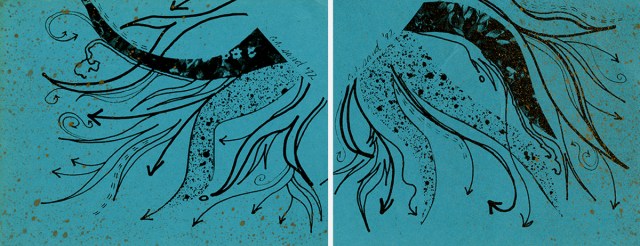
Three years later, I rallied back to making postcards and making them from original art, with a concept. Four corners, cut from one intricate piece. Each person received one part, though there wasn’t any way for them to know that.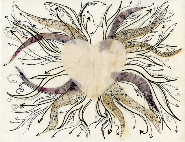
 1993’s image reverted to collage from appropriated sources. A full-page photo of an installation by Hiroshi Teshigahara, in 1989. [1] Plus more vaguely Victorian clip art.
I don’t know what made me think this was OK. Nor could I pinpoint what event conjured Tommy James and the Shondells—but that band is always good for a shivery romance jolt, isn’t it? Crimson and clover forever.
This card also has four versions, but there isn’t much drama between them. The silver paint was applied in two brushstrokes. I had the good sense not to include a signature.
1994 is irrepressibly simple and fresh.
What was used to create the type is hard to trace. There are no computer files for any of these cards. By 1989-1990, I had learned how to “word process” and was a happy explorer in the land of XyWrite. [2] This text, however, looks like Quark, which I definitely knew how to play with as of 1994, possibly earlier.
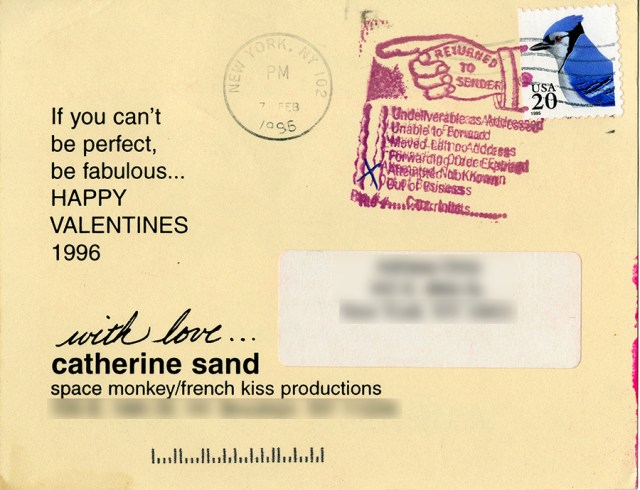
In 1995, I decided to tweak the “Love is …” cliché, which no doubt keeps on cropping up in a juggernaut of what are now known as “memes” though I’m not going to search to verify because I just don’t have the stomach for it. A gold-ink pen was used to add my famous squiggle and fill in two symbol boxes on the front plus place a little heart over the word “happy” on the back. The stamp, this time, is on point.
Have you noticed how gorgeous many new stamps are? If not, check them out. Maybe even send somebody something. I still pop some bills in the mail just for the opportunity to place a stamp on an envelope and hope someone, somewhere enjoys looking at it.
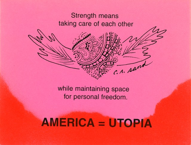
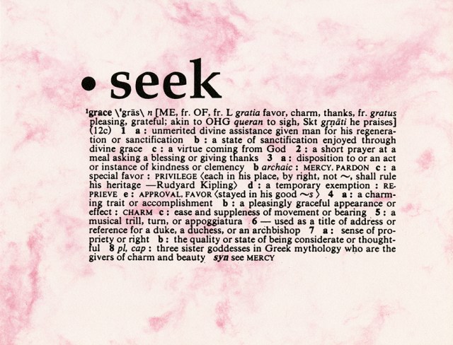
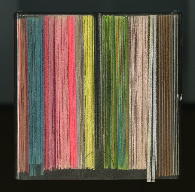
Back to spray paint in 1996, and two different colors for the cardstock!! I also got extravagant in the message theory, with a straightforward definition of strength coupled to a not readily apparent belief that utopia is ever to be worked toward, not achieved. Soft-core anarchist in the house.
1997’s card shows how purple paper tends to fade and there’s a lot to be said for allowing yourself to be flexible when it comes to celebrating holidays. Just a hint of clip art here, confined inside spray-painted paper cutouts. The poetry still rings true, though now through a murmur of seasons gone awry and butterflies disappearing from the planet.
The next to last year, 1998, was the most spectacular in every way. [3] 400 cards printed, message on the back, simple signature on the front. Took a six-sided nut and set it on a card, then sprayed it with Krylon in three colors—two fluorescent and a semi-gloss grape. All kinds of insane, lovely things happened in the mix, and it’s really, really hard to choose which ones to show. Yet I will.
Sign of the Vibrating Colors (SOTVC) makes her first appearance here. Pre-postcard working notes: “What are your signals? … Zodiac Cat … Resonate.” [4]
Once I made the commitment to create hundreds of small paintings, Touch of Grey was a tour de force. I was determined the cards would be postmarked May 1st, and they were. Finished the night before, subwayed to the Post Office (the iconic James A. Farley Building), walked in a bit before midnight, stepped up to the window, handed them over in open-topped boxes, and the teller exclaimed, these are beautiful. They were.
When 1999 rolled around, you can kind of tell I’m rolling into other things. On the verge of immersion in cyber world, actually. Now how did that happen?
[1] The hijacked photo used for 1993’s collage appears in an article by Janet Koplos, “Through the Looking Glass: A Guide to Japan’s Contemporary Art World.” I have the original pages, but there’s no magazine name and no credit for the photograph, which proves to be elusive. Fortunately, other documentation of Teshigahara’s work in ikebana abounds, for example, Sogetsu Foundation, “Hiroshi Teshigahara: The 3rd Iemoto 1927-2001,” 2010, www.sogetsu.or.jp/e/about/iemoto/hiroshi and, especially, Sogetsu Kai Foundation, “Exhibition Catalogue: Hiroshi Teshigahara,” National Museum of Contemporary Art, Korea, 1989, www.mmca.go.kr/upload/temp/2018/01/2018012212083815414007.pdf.
[2] On the beauty of XyWrite: Amy Virshup, “The Xy Files,” Salon, August 25, 1998, www.salon.com/1998/08/25/feature_287. I loved it for writing because there was nothing on the screen except a cursor and green or amber text shining through a black background. Seriously poetic.
[3] People who received the card in 1998 called and wrote notes … “Your postcards are beautiful; please find reason to write about the summer, fall and winter so I can get mail from you four times a year.” “I feel empowered, girlfriend.” “It will be a treasured part of my postcard collection in the rack on my wall.” “Where the blue meets the purple, it looks like the eye of a peacock feather. It’s just spectacular.” “I’m going to frame it.”
[4] If you’d like to read more about the self-identities, check out SOTVC: The Violet and Green Edition.
To everyone who is, has been and will be part of this, even if we don’t allways know how: you light up my life.
Words and images by Catherine Rutgers © 2020





Dear Catherine Arcolio (Leaf and Twig), it’s so good to see that you enjoy this post. As you know, I have long appreciated your blog. Also just discovered your portfolio at https://fineartamerica.com/profiles/catherine-arcolio and want to thank you for the description of creating images that “are invitations for viewers to experience the renewal and nourishment of slowing down, being still and focusing attention.” A perfect thought for today and every day.
LikeLike
Thank you for liking this, Josie Holford of “Rattlebag and Rhubarb”!!
LikeLike
These are so interesting. (AMERICA=UTOPIA?)
And the squiggle ones reminded me of the Squiggle game that Donald Winnicott invented as a way to communicate with child patients He would make a “squiggle,” and the child would add onto it.
LikeLike
Hello, Josie Holford! Thank you for the interesting squiggle association. The “Fragments” is a time-capsule journey, revealing many changes and a few common threads from twenty to more than thirty years ago. My postcard in 1996 was a poetic statement. Basically, that the idea of “America” is utopian—the egalitarian and free democracy promised at its beginning. Despite the historical reality being very different from the stated intentions, the seeds of possibility are still here. My concept of “strength” counters the seemingly predominant definition: power over others. I have no idea what events prompted these musings at the time. ^ _ ^
LikeLike