Handwritten, Typewriter, Type

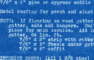
Quantity Survey: scanned blueprint date unknown © Catherine Rutgers

Detail from “Design No. 6-G-4: Quantity Survey,” a blueprint that belonged to my grandfather, date unknown. The paper is strong and flexible, the blue is waxy. I can see that the text has somehow been created by removing the color but have no idea how the process actually worked.

What tools do we use for writing? Until you get to computer-generated type, everything is potentially messy, sometimes smelly, and always ready for appropriation into an art project. Used typewriter ribbons? Exquisite. Outtakes from the mimeograph? Fabulous.

I had a manual typewriter in college and wasn’t all that skilled at creating neat pages. Now, however, I am crazy about the way the red bleeds out of the black and how the paper yellowed but the whiteout stayed white. Although the IBM Selectric was introduced in 1961, they were expensive, big, and heavy. I can’t remember anyone who had one at home.

Photo by Etan J. Tal: IBM Selectric II dual Latin-Hebrew Hadar typeball, Creative Commons Attribution 3.0 Unported

Typeball. Photograph by Etan J. Tal, November 12, 2009 en.wikipedia.org/wiki/File:SelectricII_Hadar.jpg

As described at http://en.wikipedia.org/wiki/Typewriter,
“The Selectric used a system of latches, metal tapes, and pulleys driven by an electric motor to rotate the ball into the correct position and then strike it against the ribbon and platen. The typeball moved laterally in front of the paper instead of the former platen-carrying carriage moving the paper across a stationary print position.”

There was no doubt you were using a machine: awkward,
noisy, busy in and of itself. Office procedures as the frame
for analyzing change over time will reappear in future posts.
For now, the essay’s visual.

Endnotes Detail 1976 © Catherine RutgersHandwritten on paper circa 1991 © Catherine RutgersScanned from printout: font is Courier New - CatRutgers4art 2011Dada-Surrealism: handwritten in pencil 1976 © Catherine RutgersTime Machine: handwriting inverted © Catherine RutgersText and images by Catherine Rutgers © 2011.


Posted in Revelations | Tagged , , | 7 Comments

Party Over Here

The whole nine yards are essential;  Amethyst Dish CatRutgers4art © Catherine Rutgersthe aesthetic is abundance. Put everything you have into making it happen, and you’ll get back more than you ever imagined.

Every party should envelop guests in an alternative environment, swallow you up in happiness, and not ever let you know how it was done.

Preparation is the prelude to the fun. When everything glows and the colors make me feel like dancing, I’m ready to think about the food, music, lights. For this special occasion, in 2007, I couldn’t resist snapping the place settings, dishes, and other ingredients beforehand. The glass pebbles and polished stones are now in the garden, a happy reminder of a really good time.

Cleanup? Also part of the pleasure: if there isn’t any mess, there wasn’t any party.

Party Image 0552 CatRutgers4art © Catherine RutgersParty Image 0567 CatRutgers4art © Catherine RutgersParty Image 0557 CatRutgers4art © Catherine Rutgers 2011Original photographs by Catherine Rutgers © January 2011

Posted in Snapped | Tagged , , , | Leave a comment

Hue-Happy Forever

I was born to find ecstasy in color. And hue adjustment was made for me. The fruit of a most delightful new-year’s-eve afternoon ­– six variations on Saturated Bliss are presented here for your viewing pleasure.

Bliss One © Catherine Rutgers 2011Bliss Two © Catherine Rutgers 2011Bliss Three © Catherine Rutgers 2011Bliss Four © Catherine Rutgers 2011Bliss Five © Catherine Rutgers 2011Bliss Six © Catherine Rutgers 2011Six variations on Saturated Bliss © Catherine Rutgers 2011

Posted in Revelations | Tagged , , | Leave a comment

When You Subscribe

Saturated Bliss for 2011 and Beyond from Catherine Rutgers

Hi, there! This is a new adventure, full of options. And creative experiments are this blog’s core. So, the first tests of what gets sent to subscribers in email were the full posts, including multiple images and text. From here on, I’m going with the streamlined version: title, opening lines, and a link. As CatRutgers4art rolls along, I’ll monitor and adjust. So feel free to comment on how it works for you.

If you’re thinking about subscribing, excellent! WordPress lets you decide when and how often to receive notices of new posts.  Now, it’s up to me to get them done. With all best wishes, Catherine Rutgers

Posted in Introductions & News | Tagged , | Leave a comment

Blessed Be the Glue

Glue Detail Screen Grab © Catherine Rutgers 2010Threads that connect have generally been my preference over ties that bind. But my relationships with glue, paste, and their tacky, odoriferous mate – rubber cement – have rolled and twisted over the years.

This might seem disgusting, but the paste we used in the early 1960s was made out of horse bones, it tasted like mint, and all of us grade schoolers used to eat it. Mucilage, on the other hand, was just continuously distasteful. Poor performance and an annoying word to boot.

Elmer’s Carpenter’s Interior Wood Glue is no doubt the best, despite the awkward name. Not only does it leave a lustrous but not-too-shiny sheen over paper and canvas, as far as I can tell it lasts forever. Things that aren’t glued properly fall apart. This used to drive me crazy until I noticed the caramel-colored traces left behind. Four new scans of this effect are shown here.

Did I mention pouring a thin layer of Elmer’s on your arm, waiting for it to dry, and slowly peeling it off? We kids did that, too.

Open Door Light 1979 and 2010 © Catherine Rutgers 2016

Glue Revealed 1979 and 2010 © Catherine Rutgers 2016

Globe for Reposed 2010 © Catherine Rutgers 2016Catherine Rutgers © 2010

Posted in Revelations | Tagged , , , , , , | 3 Comments