Guest Spot: Ellena Rutsch

Slipping into Darkness Detail © Ellena RutschThe art of Ellena Rutsch is an electrifying journey into the world of paint. Lustrous, gritty, glistening painting that echoes nature and rides into the realm of imagination.

Here’s the good word from the artist: “My artwork has been described as ‘big, bold, and warm,’ and I rather like this description. Of course, to me they are not just paintings. I want my compositions to be true, vivid, and spontaneous, a reflection of myself. No compromise! My aim is not to please but to cause emotions. I’d rather have somebody hate my work than merely like it …

Le Millénaire 2 © Ellena Rutsch

“Le Millénaire 2” by Ellena Rutsch: 39.4 x 59.1 inches, acrylic and oil, 2009

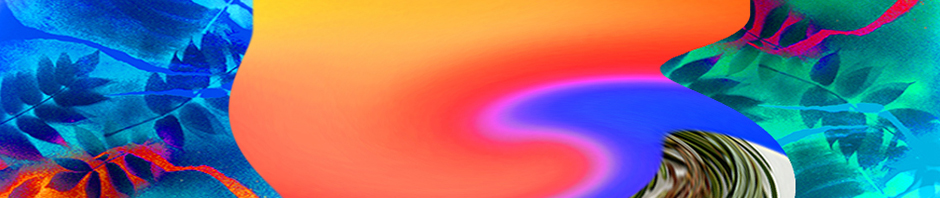
“Passion is definitely the leitmotiv! My paintings are almost like poetry to me, and they are closely linked to music, too. One could probably not exist without the other. Freedom is Freedom Is Mine © Ellena RutschMine (shown at left) spontaneously comes to my mind. I deliberately chose the climax of Nina Simone’s refrain instead of the title, ‘Feeling Good,’ because it totally reflects how I felt the evening I created this canvas. That day I made a hell of a decision and changed my life for good!

“What’s fascinating to me about this painting is that half of the viewers ‘saw’ what I saw when I painted it – an eruption of the Pacaya Volcano in Guatemala – but the other half saw some kind of Egyptian goddess rising from the ashes. It’s this type of reaction that I like so much.

“Other paintings, such as Crosstown Traffic Dripping Experience, carry the full name of a song. I love Jimi Hendrix and was listening to ‘The Ultimate Experience’ when working on this canvas, exploring Jackson Pollock’s dripping method for the first time. Although I have worked with ‘realism,’ Blue Moves © Ellena RutschI have found that abstract is the only form that gives enough freedom to imagination, interpretation, and rêverie – for both me and the viewer.

“I feel close to Zao Wou-Ki, a French painter of Chinese origin, and agree completely with his vision that ‘Ce qui est abstrait pour vous est réel pour moi’ (what is abstract to you is real for me). Just like him, I am of different origin. Born in Australia some forty years ago, I grew up in various countries in Europe, including Germany, Belgium, and France (and they are very different from each other). Although I ‘blend in’ as much as I can, I am also trying to hold on to my roots and to mix them with new influences.

“Occasionally, I work on commission, which I find extremely challenging. Recently, I was requested to create a painting something like Le Millénaire 2 – in shades of blue, green, and purple. Blue Moves (above right) was my second attempt, and Cosmic Girl (at left) Cosmic Girl © Ellena Rutschwas my fifth and final version. Orchidées sauvages is a by-product of this series (the second image, below, is a detail). In a way, it was born out of frustration. But it has turned out to be one of my strongest paintings.

“Last but not least, I have recently come to terms with the fact that I am no new Basquiat. But mixing acrylic with oil is what suits me the most! Only time will tell … stay tuned.”

And there’s much to be attuned to. Ms. Rutsch lives in Montpellier, France, where her work is included in multiple shows that began in June and run through September. The range and depth of her art are astonishing, but Guest Spot can offer a taste from the banquet. Forthwith, here are close-up views of Blue Moves, Orchidées sauvages, Cosmic Girl, and Champs de coquelicots!

Blue Moves Detail © Ellena RutschOrchidées sauvages Detail © Ellena RutschCosmic Girl Detail © Ellena RutschChamps de coquelicots Detail © Ellena RutschThe artwork is this post is by Ellena Rutsch © 2011

Posted in Guest Spot! | Tagged , , | Leave a comment

“Wake Up in the Morning Feeling Like P Diddy”

Moon Birds 909 © Catherine RutgersI love “Tik Tok” and I loved reading that Ke$ha based her style on Keith Richards. Long live rock. Long live pop (pulp) culture.

Nearly everything in music is based on something else, isn’t it? Jazz, show tunes, cantatas: they all appropriated something from somewhere. And the genius part is when nobody gets uptight about this because we’re all enjoying ourselves too much.

Same is true for collage, which is (usually) appropriation and was my first medium for art. Beginning in the year I turned thirteen and discovered Tiger Beat and the New York Times fashion supplement, I spent hours perusing pages in a magazine, tearing them out, taping them up on walls, and carefully gluing them to paper and canvas.

The thing about collage is that it’s so much fun. You take things and you make new things. This was a seminal technique for the Dadaists, the Surrealists, and so many artists, including, of course, Robert Rauschenberg. But in my own work, I was haunted by giving credit where credit is due.

With rare exceptions, everything since the ’80s is made from my own sources – photographs, drawing, scans, and paintings – with scattered found objects and an occasional tidbit of wrapping paper. My new work is often digital collage, playing in the wide-open field where collected treasures can be altered in a million different ways. For the Unbearables Assembling Magazine, 1998, reversion to the mélange was irresistible.

Materials Mix © Catherine RutgersFullmoon Spring © Catherine RutgersIcon 0724 © Catherine RutgersCarnaval All the Time © Catherine RutgersAilanthus Merge © Catherine RutgersRedwall Concept © Catherine RutgersNew Leaf © Catherine RutgersText and images by Catherine Rutgers © 2011

Posted in Revelations | Tagged , , , | 1 Comment

Guest Spot: Kristen Terrana

My Precious Detail © Kristen TerranaOK, let’s crank up the heat and kick out the jams. Kristen Terrana’s Mad Hatter Girls should do the trick perfectly.

I first fell in love with My Precious after watching the artist at work on YouTube and was thrilled to meet her cohorts in person at Jadite Gallery, this spring.

Born and raised in New York City,
Ms. Terrana is accustomed to the frenetic sights and sounds that bombard our minds daily. The vibrancy that is part of this city is reflected in her use of bright color and movement, and she finds the fluidity of watercolors and ink to be ideal for expressing this excitement.

Here’s the good word from the artist: “My subject matter can often be grotesque, and I exaggerate the emotions of each piece. There is a dark humor and irony hidden for the viewer to find. Things may appear light-hearted from afar, but upon closer inspection, there is a darker truth. I take inspiration Suck My Kiss Detail © Kristen Terranafrom the German Expressionists, who used their art to comment on the ugliness that they saw within society. I enjoy using art in a similar way, to make a statement about vanity and the pressures on women today.

“My latest series depicts a group of extraordinary characters called the ‘Mad Hatter Girls.’ Facing the demands of society to stay young and beautiful ‘naturally,’ the women in these paintings heavily adorn themselves with animals. The women believe they are enhancing their beauty and hiding their flaws, under feathers, fur, and scales. But the beauty of nature is taken to the extreme. The Mad Hatters become overpowered by their animal counterparts, and their vulnerabilities become revealed in the chaos.”

And their strength. Bold, giddy, and (sometimes sweetly) demented – Guest Spot is delighted to present My Precious, One Headlight, Bird of Paradise, Suck My Kiss,
and All that Glitters, by Kristen Terrana.

My Precious © Kristen TerranaOne Headlight © Kristen TerranaBird of Paradise © Kristen TerranaSuck My Kiss © Kristen TerranaAll that Glitters © Kristen Terrana

Original artwork by Kristen Terrana © 2011.
Portfolio: www.kristenterrana.com; @kristenkahlo on Instagram

Posted in Guest Spot! | Tagged , , , , , | 1 Comment

Good Friend Down

Between the Oaks © Catherine RutgersThey are giants. Two oaks towering more than six stories high. And in between was once a sinuous and not so small maple tree. Look through the teen-aged pine and you’ll see her on a snowy day.

Weed whackers and leaf blowers drive me crazy. But the sounds of a chainsaw and attendant wood chipper wrack my deepest nerve. I rarely document the final demise of the various peak-growth beauties in my neighborhood, perhaps feeling it too deeply, even though I’ve watched it more than once.

This time, I took out the camera and captured the chop-down on January 14, 2011, the messy aftermath three days later.

Tough and Dangerous Job © Catherine RutgersMostly, we’re losing maples to disease and age. One magnificent tree spread high above rooftops, across two-homes-worth of backyard lawn, perfect against the sunset for years and years, then lost all its leaves in a few midsummer weeks. Irretrievable. And though the decaying branches would have made lovely homes for birds and insects, they must have been thought of as likely for falling in the stormy winds that have become increasingly common.

It’s a tough and hazardous job, taking down a behemoth. The crew worked hard through most of the day. But I think they cut this one down too soon. It has taken me six months to complete this winter story, move through the cutting and on to remembering our splendid friendship, to cheers for the beauty of branches, leaves, and sky.

The Peak © Catherine RutgersOrange, Green, and White © Catherine RutgersPerspective Image 2283 © Catherine RutgersTied and Inverted © Catherine RutgersWithout © Catherine RutgersShades of Night Are Falling © Catherine RutgersIn Snow © Catherine RutgersRed Sky at Night Image 1272 © Catherine RutgersBuds of Spring © Catherine Rutgers

All images and text in this post are by Catherine Rutgers © 2011.

Posted in Snapped | Tagged , , , , | 1 Comment

Guest Spot: Brian Olewnick

Stone 09C © Brian OlewnickBrian Olewnick is a painter, a writer, and curator of an outstanding social-network page for those who seek visual inspiration and lively conversation on art and music. He’s also creator of the blog “Just Outside,” which features write-ups on new recorded music, concerts, the occasional movie, and “dips into” his vinyl collection.

I’ve known Mr. Olewnick since 1968, and he was always known for his artwork. So it was a remarkable surprise, during the early years of the 21st century, to hear him say he’d rather look at paintings than make them. The hiatus, however, was not interminable. Here’s the good word from the artist:

Two Pines Sketch 25 © Brian Olewnick

Discrete objects in separate but shared space: two pines, drawing by Brian Olewnick.

“I’d drawn and painted most of my life but, around 2003, I took a break, writing having begun to take up most of my spare time, plus having the sense that I’d done more or less what I could do in the visual field. Strenuous urging from several friends spurred my return in the spring of 2009, and I’ve been doing what I can as time permits since then.

“I’ve always tended to work small, often using the same objects I’ve kept around and grown attached to for decades, showing a marked preference for stones, sticks, and other odds and ends. I’ll frequently do a number of versions of the same object, often in the same position, while varying other properties.

“Though I tend to work in a realist manner, I’ve always loved abstract painting, simply feeling it wasn’t my territory. A happy halfway point has been painting fabric. I had the idea of doing sets of four watercolors of t-shirts of mine (another kind of object I’m very attached to). First, a red one, then an indigo one (which appears after the text) and finally a light gray one.

Scan 0003-2 © Brian Olewnick

Fully abstract: kind of a bastard child of Rothko and Newman, several times removed.

“I was able to straddle a line between color field and realism that I enjoyed very much, likening it (in approach, certainly not in quality ) to Morton Feldman’s late piano music. In the gray set, I began working in extremely light washes, almost not there (a personal homage to Agnes Martin) and think they’re among the most successful things I’ve done – but they don’t scan well at all! I’ll also do the occasional fully abstract piece, kind of bastard children of Rothko and Newman, several times removed, though I don’t feel entirely comfortable there.

“My drawing seems to vacillate between similar poles – I’ve always liked the idea of two discrete objects in a work, in separate but shared space, and did a series of pines in the fall of 2009, one of which is shown above. At the same time, I began to greatly enjoy the plain markings of the pen on paper (after coming to more greatly appreciate Twombly, I think) and have done a number of sparser things, still reality based.”

Guest Spot is very pleased to present a selection of recent work by Brian Olewnick. Back in the three-dimensional world, the originals are in the vicinity of five by five inches. Here, you can right-click to view a larger, digital image.

Indigo Shirt Number One © Brian Olewnick

Indigo Shirt Number Four © Brian OlewnickIndigo Shirt Number Three © Brian OlewnickStone 09 © Brian OlewnickStone 01 © Brian OlewnickStone 02 © Brian OlewnickStone 04 © Brian OlewnickAll images in this Guest Spot represent original artwork by Brian Olewnick © 2011.

Posted in Guest Spot! | Tagged , , , | 1 Comment